Thursday, September 26, 2013

Jimmy Freckles, the Asteroid Boy--Character Design meme


Line art: drawn and inked in my trusty dusty sketchbook, scanned into Photoshop, cleaned up and detailed.
 
Background turned into a layer and turned to Multiply.  Created another layer and placed underneath to add color.  Created the title in Illustrator and copied/pasted into Photoshop.

Tuesday, September 10, 2013

CMI Promotional Video Art

Content Marketing Institute commissioned me to do some Star Wars-esque art for a promotional video for CEO Joe Pulizzi's new book. Here's the link to the video:
youtube CMI promotional vid
Here's CMI's website:
contentmarketinginstitute.com/

 The effects of bad content marketing

Jedi Joe to the rescue!

Jedi Joe confronts bad content marketing

Jedi Joe defeats bad content marketing
  
Is this the end of bad content marketing???

"Hmm..."


 Group reading

Sound advice


Adobe Illustrator CS2

Monday, August 12, 2013

Freelance Art for CMI

The Creative Director for Content Marketing Institute contacted me to do a number of customized illustrations to use for an e-book, their blog, and a book written by their CEO.  I'll post the art for the book after I receive payment for the art.  Until then...
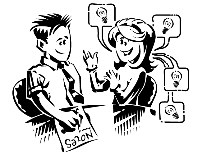
The art direction for these four e-book illustrations had me imitating the art style of this video  --a sort of slick cartoony marker rendering.  They also asked for a sort of "everyman" to appear in various circumstances, to which we now refer to as "The Dude".
 
I submitted freehand sketches first for approval, then opened the sketches in Illustrator and traced/streamlined them.  These illustrations will go into an e-book.

These next illustrations went into a number of CMI's blogs.  The first batch they considered too "stock"...
These next illustrations they asked to do in "The Dude" style, so back to the cartoony style--
 
The direction for this suggested something like a dragon with "Lead Gen" on it somewhere, and someone with a sword.  I thought a biker beast with "Lead Gen" graffitied on a leather jacket versus a sci-fi ninja chick with an energy sword would be less generic
They asked me to do a color version of this toolbox to go with a presentation--

Tuesday, February 26, 2013

Three samples I created for a potential client showing "business" illustrations they could use for their blog.  

Adobe Illustrator CS2

Monday, February 4, 2013

Groovy Doom Blog Header

http://groovydoom.blogspot.com/
My buddy Bill asked me to create a header for his blog Groovy Doom where he reviews horror movies which fall within his favorite genre.

I started a new file, 700 pixels wide by 430 pixels deep at 72 ppi (the size of the header on his blog at the time).  I opened a photo of my pal Skully the Skeleton in Photoshop and, using the Move tool, dragged and dropped the photo right into the new image space, creating a new layer.  Now I had the Background layer and Layer 1.

Skully's photo was waaay too big for the small image size (the original photo was 2176 pixels wide by 3384 pixels high at 300 ppi!).  So, with Layer 1 selected I hit Ctrl+t (Free Transform) to put a Free Transform bounding box around the photo.  Then, holding the Shift button, I manipulated the corner nodes and shrank the photo down until the head fit inside the image area.  Once done I tapped Esc.

To erase the unnecessary background, I used the Pen tool to outline the skull, which creates a vector mask.  I right-clicked over the vector mask to get the Make Selection... option and pressed Okay.  I deleted the Shape 1 layer in my Layers palate so I was left with just marching ants.  I inverted the selection (Ctrl+Shift+i) so I had the entire background selected, then pressed Delete.  This left just the skull on the top layer and the Background layer showing underneath.

I adjusted the colors (Ctrl+u brings up the Hue/Saturation dialog) of the skull and Background layer, manipulated the layer styles and blending modes until I came across something appropriately creepy.  I flattened the layers (Alt+l+f) into one Background layer, then saved the file as a .png.

Opening the .png in Illustrator, I used the Pen tool to draw the letters for "Groovy".  I knew I wanted the two o's in the middle placed over the eye sockets of the skull.  When the letters looked close to what I wanted, I opened the Effects/3D/Extrude & Bevel... option.  Manipulating the Custom Rotation box with the Preview checkbox checked, I rotated the letters to match the angle of the skull.  Attempting to move the shape nodes of the original shapes caused the 3D effect to blink out and lose the colors (If I'd have remembered what I wrote about this tool in a prior blog on my DeviantArt page http://vallianteffort.deviantart.com/gallery/?offset=96#/d2e7iai I wouldn't have gone anywhere near it!).  Once finished I selected all the letter shapes and went to Options/Expand Appearance which converted the 3D effect into vector art (with an excessive amount of nodes and layers of shapes!!  Would rather have created the letters freehand with just the Pen instead of using this tool.)

For "DOOM" I used the typeface Impact.  After typing I turned the type into vector shapes via Ctrl+Shift+o.  I then went to Filter/Distort/Roughen... and used a setting like Size: 1 and Detail: 18 with Relative and Smooth radio buttons selected.  With "DOOM" selected I copied and pasted another version in front, offset the two copies, and played with the colors, Blending modes, and Transparency until I found something I liked.

I'd like to go back in and make some little changes, like the distance between the o's and the size of the D in comparison to the M, but otherwise I'm happy with this, and so was my buddy.  :)

Photoshop CS2/Illustrator CS2