Monday, December 22, 2008

Illustration Friday-- Voices

3D Max, Photoshop, Illustrator

The angel girl and baby Jesus are 3D. 3D isn't my strong suit, but I think they came out nice.

The background is a digital photo of two pillows; one to represent ground, the other sky. I used extreme selective focus to allow everything except the piece of ground the cradle is on to blur. I took the photo into Photoshop and beat on the color until I hit something I thought would work.

The stars and text are Illustrator. I created one star, then used the scatter brush option so I could simply draw a few paths and multiple stars would appear.
The text is Nueva Std bold, with a drop shadow behind it.

The Bible verse comes from the gospel of Luke, where he relates the astounding miraculous details surrounding and including the birth of our Jesus Christ, our Lord and Savior. Luke also wrote the book of Acts, and is renowned for his historical accuracy and details.

Merry Christmas. :)

Wednesday, December 17, 2008

Blog revamp

All of my older blogs had pictures imported from Flickr. I just deleted my Flickr page, which, of course, fouled up my old blogs; so, I figured I'll 'start over', instead of going through the work of digging through all my CD's to find the art that matches the blog, etc. I'm very grateful for Blogger's export feature which allowed me to save all my text to my hard drive. :)

Thursday, December 4, 2008


Adobe Illustrator/Adobe Photoshop CS2
I'm pretty happy with the way this logo looks. :)

Friday, November 28, 2008

Illustration Friday: Balloons

Adobe Illustrator CS2

My current wallpaper. :)

Tuesday, November 25, 2008

Retro Car

Adobe Illustrator CS2

Saturday, November 8, 2008

Desert Hawks --"Sandstorm"

Adobe Illustrator CS2
Starting an illustration for myself I don't usually have any plan, just an idea of something I want to draw. This piece turned out to be an exercise in curvilinear perspective.

I drew the robot first. I then added the car, man, and road, then realized I'd better do this in correct perspective if I want it to look right. I eyeballed where I thought the horizon should be drawing lines from the car to see where the vanishing points would hit. One hit well inside the picture, and the other way off to the right outside the frame. Without really thinking about how I'd do the rest of the picture, I fixed the perspective on the car according to these vanishing points. I realized quickly that my poor choice of the left-hand vanishing point location would distort everything to the left of that vanishing point, a big Mechanical Perspective 101 no-no.

Unless I wanted to move the vanishing point off to the left (what I should have done in the first place had I been thinking) and redo the car with the correct perspective (NOT a happy thought), the only other solution was curvilinear perspective, keeping the left vanishing point as the center point, sort of like 1-point perspective, and manipulating the perspective in a circular fish-eye lens fashion, much closer to how the humans see things as they turn their heads from the pivot point of the neck and look around. Not a problem really, but more work than I'd considered putting into this drawing. Turned out to be a decent solution, though, as the rest of the illustration fell into place after that. Nothing amazing, but it worked in a fix.

The colors are mostly brown and bluish-green, basically color compliments, with some yellow and violet added for drama and contrast. :)

Monday, November 3, 2008

New Art


Adobe Illustrator CS2

Tuesday, October 7, 2008

Ninja Robot Monkey!

Adobe Illustrator CS2

    I had an old illustration I decided to expand on.  I wanted to add a blurred background to make the sharp vector character pop forward, and I wanted to add a logo.
    I made a purple triangle and placed it behind everything.  I rasterized the triangle and added film grain texture.  I added zoom blur to get the speed effect.
    The title text is LCD.  I wanted the text to look like LCD numbers on an alarm clock.  I copied and pasted two versions of the text behind the original.  I moved one set slightly to the right and the other to the left.  I lowered the transparencies, then changed the colors to add depth.  I created a row of thin lines in front of the text.  I played with the transparency and colors to achieve the T.V. lines effect.

Sunday, October 5, 2008

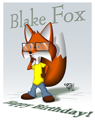
Birthday Boy Anthropomorph

Adobe Illustrator CS 2

I don't know how much this actually looks like the boy I based the picture on, but for me, it captures some of his thoughtfulness and complexity.
Just a straightforward illustration. I created all the base shapes, then used the Offset Path command with negative numbers to make smaller inner shapes. The base shapes I gave darker colors, the inner shapes lighter colors, then blended.
I used the Free Transform tool to put the sidewalk and text into perspective. :)

Tuesday, September 23, 2008

Freelance t-shirt designs

Here are a few ideas I put together for a t-shirt for our church.

Close-up of t-shirt back design
There's a big sign out in front of the church which (as far as I can reckon) uses Times New Roman for the "Glenshaw" and Arial for the "Alliance Church", which I used for my version. I then used a few different offset path thicknesses to achieve the 3D effect for the logo.
I appropriated the photo of the church from their website and traced it in Illustrator.
The background came via the scribble stylize effect. Front and back
Church name logo ideas
The logo with all the symbols is the Christian and Missionary Alliance logo, which I found a big version on the web and traced.
Adobe Illustrator CS2

Tuesday, September 9, 2008

Space Cat Enters Reptile Temple

Adobe Illustrator 8/CS2
    I created this at a time when I wanted to learn cartooning. I always thought of myself as a realist and considered cartooning beyond my grasp. I really had to go back to the basics.  I looked at lots of 50's modern art, abstract art, animation, Jack Kirby, and I don't know what all, to better understand basic shapes and simplification in cartooning. 😀

DJ Spooks freelance illustration

Adobe Illustrator

I created this for a lady from Kuwait I met on Flickr. She posted a photo for me to use as reference.

When I first saw the photo, I knew exactly what I wanted to do with the glasses.
I initially traced the head and facial shapes, which looked rather random and helter-skelter when I finished. I then manipulated the shapes --straightening, rounding, simplifying... trying to unify them, creating a flow with the shapes for a more graphic feel.
I used two different halftone screen sizes for the face and the cap. The sharp, detailed, and close-up photo revealed the man's pores, suggesting to me the halftone screen as how to imitate the effect. The cap was knit, and I thought the bigger halftone screen captured the feel of it well. :)

Saturday, August 30, 2008

Running Cook


I created this in Illustrator. I used a 4 square checker pattern, top row black/white; bottom row white/black, for the pants tile pattern.
I used just enough blue/white gradient and gray shadow to make the white jacket and hat stand out from the white background.
I kept my line work simple, varying the thickness to give some of the 'under areas' and shadow-y areas more weight, ala "How to Draw Comics the Marvel Way" by Stan Lee and John Buscema. (A MUST have!)
I worked to keep the design of the character balanced, not just wanting to create a character, but an iconic image. :)

Friday, August 29, 2008

Clueless Cooks Banner

Adobe Illustrator

A blog header banner for my wonderful friend Silla. Her current blog is the Bits and Pixels over in my links. :)