Showing posts with label character. Show all posts

Saturday, August 28, 2021

Commissioned Stylized Caricatures

"The Bad-Joke Guys"

    A friend commissioned me to illustrate his idea of him and his two buddies, all in Christian ministry coming from different walks of life.

    I should have made this a vector illustration in Illustrator instead of a bitmap illustration in Photoshop with a Wacom.  Fixing mistakes or making changes took forever.  I used the Brush tool for most of the project.  I used the default black foreground and white background; I drew with the black, then pressed x to 'erase' with white.
    I used the Pen Tool to create the patches on the vest:
  1. In the Brush Tool options, I set the Brush Master Diameter to two points
  2. I used the Pen Tool to draw a path in the shape of the patch on the vest.
  3. I right-clicked over the path to bring up the Stroke Path option
  4. Clicking the Stroke Path option brings up the Stroke Path / Tool: option dropdown menu
  5. From the dropdown menu, I selected Brush, and a 2 point brush line stroked the path
    I made the chains on the front of the vest in Illustrator with the Art Brush tool.  I imported the chains into Photoshop as Smart Objects, so I could resize them without losing resolution.  I made the background in Illustrator also.

    My friend liked the finished product.  He surprised his buddies with copies for each of them, and they liked it also.

Monday, May 25, 2020

Adventure Time-Inspired Caricatures

Adventure Time-Inspired Caricatures
      I had a lot of fun with these two illustrations, based on two co-workers and influenced by an overdose of 10 seasons of Adventure Time.  It doesn't take much to inspire me to create, just the right impetus.
     Adventure Time uses a lot of flat colors, and simplistic, abstract shapes.  They use lighter colors to represent lit sides of the forms, and darker colors to represent shaded sides, which gives the characters and objects some dimension.  The art style -- with minimalistic, wiener-limbed characters and primitive-looking, detailed backgrounds -- has an original, iconic, and instantly recognizable look.  I had to work within the parameters of the style so the viewer would recognize the style I drew the illustration in.
     I started off with Post-It© drawings of the two gentlemen I had in mind.  I had just watched the first guy's prog-rock trio, Flock of Walri, in concert at a local venue.  The band members all wear matching pink flamingo shirts.

Post-It© Drawing
    I photographed the drawing with my phone and Blue-Toothed it to my computer.  I realized my co-worker plays right-handed, so I had to horizontally flip the picture.
     I opened the drawing in Adobe Illustrator and traced the outlines with the Pen Tool.  I selected the outlines and used Pathfinder / Add to Shape Area to combine all the outlines into one shape.  Then I manipulated the nodes to finish off the shapes.
    I struggled to get the three-tone shading on the dreadlocks right.  I used dark, medium, and light shades of gray.  I kept the light source in front of the face, which helped me place the highlights and shadows.
     The black outline of the dreads took the most time.  I set the Keyboard Increment to something very small, like .001 inches (Preferences / General / Keyboard Increment) so I could move the nodes in small increments with the Arrow Keys.
     I used shapes with Transparency for the blue shadows on the shirt so the lines and flamingos showed through.
     Making the illustration look Adventure Time style proved the hard part.  
 Adobe Illustrator CS2

 Pink Flamingo

Post-It© Drawing
    It took me a while to get the forms and shading of the cliffs to look how I wanted, using just four colors and a handful of flat, abstract shapes.  I found the right kind of off-kilter balance the show masters so well only after a lot of node poking.
    The background: I wanted a warm desert background, so I made the sky yellow and the other objects with colors tinged with yellow.  I used less contrast between colors, and no dark colors, to create atmospheric perspective and make objects appear further in the distance.
    The foreground: the figure and guitar have darker colors, some black, and more contrast between colors.  I used cooler complementary blues and greens to separate the foreground from the warm background.  The complimentary colors, contrast, and darks help the objects in the foreground look closer to the viewer.
    I used a right-hand light source, with the sun out of the scene to the right.  The objects have shadowed areas on the left side, and cast shadows fall onto objects behind lit objects.  A hint of blue behind the cliffs represents reflected light.
    I had to do some thinking and reworking to make the cracks in the desert ground look right.  I made the crack in the foreground bigger, and the other two smaller as they recede in the distance, giving the impression of depth and perspective.  The middle crack sits closer to the rear crack instead of exactly in between the top and bottom cracks, adding to the illusion.
    I muffed the clouds in the illustration below, which I didn't realize until after I posted it.  Adventure Time has rounded clouds.  The clouds below look more like flat Chuck Jones-style clouds.

Adobe Illustrator CS2

 Peavey Cirrus

Monday, June 15, 2015

Commissioned Cartoon Concept

    A friend hired me to illustrate this project for their customer who had an inside joke they wanted to be printed on t-shirts.
    I sketched the rats while sitting in a dentist's lobby waiting for a friend. I scanned the rats into Photoshop, opened the file in Illustrator, and did all the blacks as vector art. 😁

Wednesday, October 15, 2014

Something I decided to ink for #inktober on facebook.  Inspired after looking at a lot of Jack Kirby art, I decided to depict a character from a little story I'm messing with, and employ some Kirby dynamics.
Pencil/Microns

Thursday, September 26, 2013

Jimmy Freckles, the Asteroid Boy--Character Design meme


Line art: drawn and inked in my trusty dusty sketchbook, scanned into Photoshop, cleaned up and detailed.
 
Background turned into a layer and turned to Multiply.  Created another layer and placed underneath to add color.  Created the title in Illustrator and copied/pasted into Photoshop.

Tuesday, September 10, 2013

CMI Promotional Video Art

Content Marketing Institute commissioned me to do some Star Wars-esque art for a promotional video for CEO Joe Pulizzi's new book. Here's the link to the video:
youtube CMI promotional vid
Here's CMI's website:
contentmarketinginstitute.com/

 The effects of bad content marketing

Jedi Joe to the rescue!

Jedi Joe confronts bad content marketing

Jedi Joe defeats bad content marketing
  
Is this the end of bad content marketing???

"Hmm..."


 Group reading

Sound advice


Adobe Illustrator CS2

Monday, August 12, 2013

Freelance Art for CMI

The Creative Director for Content Marketing Institute contacted me to do a number of customized illustrations to use for an e-book, their blog, and a book written by their CEO.  I'll post the art for the book after I receive payment for the art.  Until then...
The art direction for these four e-book illustrations had me imitating the art style of this video  --a sort of slick cartoony marker rendering.  They also asked for a sort of "everyman" to appear in various circumstances, to which we now refer to as "The Dude".
 
I submitted freehand sketches first for approval, then opened the sketches in Illustrator and traced/streamlined them.  These illustrations will go into an e-book.

These next illustrations went into a number of CMI's blogs.  The first batch they considered too "stock"...
These next illustrations they asked to do in "The Dude" style, so back to the cartoony style--
 
The direction for this suggested something like a dragon with "Lead Gen" on it somewhere, and someone with a sword.  I thought a biker beast with "Lead Gen" graffitied on a leather jacket versus a sci-fi ninja chick with an energy sword would be less generic
They asked me to do a color version of this toolbox to go with a presentation--

Friday, September 9, 2011

Mutant Attack

Pencil, inked, scanned, Photoshop colored.  Background detail done in Illustrator.  Not my best, but I like the action, composition, and perspective. :)
Illustration Friday theme: Boundaries. This spacer's boundaries are about to be imposed upon by his mutated comrade.

Saturday, July 16, 2011

Kitty Cop

Pencil drawing scanned in from my sketchbook, Photoshop color.

Friday, November 19, 2010

Illustration Friday-- Sneaky

Moroccan Mark/Adobe Illustrator
This man looks like he could be a little sneaky. :) Actually, this was a friend's Halloween costume, and inspired me enough to draw a caricature of him. :)

Monday, November 16, 2009

Big Boss Man

For Illustration Friday's Unbalanced. Usually the old man gets a little crazy around mid-week, but Nerble takes it in stride.
Adobe Illustrator CS2
Adobe Illustrator /PhotoshopWeathered version: I exported the Illustrator file as a tiff, then opened it in Photoshop. I opened a photo I'd taken of a cracked asphalt sidewalk, then dragged and dropped it onto my illustration. I blended the texture into the main illustration using the Multiply filter, then manipulated the transparency until the illustration still dominated but the texture showed through just enough.
I changed the background into a layer, then added a layer underneath the illustration layer, and turned the color to brown. I erased some of the illustration layer to let the brown background show through. Then I created some additional distress drawing cracks, highlights and shadows the Dodge and Burn tools. :)

Friday, October 23, 2009

Sweating the Small Stuff

I did this piece as a flyer for a Sunday morning Bible study I led. Unfortunately, I didn't get it to the printer fast enough (Yet another lame attempt to fit the Illustration Friday meme. This week it's Fast).
Adobe Illustrator CS2
I really enjoy the look of super-tight comic book inking, say, along the lines of The Art of Comic Book Inking volumes 1 and 2 by Gary Martin. Some of the examples in those books stagger my mind as far as tightness, getting the perfect balance of light and dark, and making all the lines work so the image comes alive, not just putting down lines however you feel like it. Another awesome book about inking is Rendering in Pen and Ink by Arthur L. Guptill; a big tome of a book that's worth every hour to read it.

The figure came first; the background and text came later. First I sketched the figure in pencil, scanned it into Illustrator, then traced it with the pen tool. I did all the blacks first, working out shadows and forms until it stood alone as a solid black and white illustration. I then started applying flat colors: 4 shades for the armor, 3 shades for the gold-lighted glass (I didn't know how many layers of color I would use originally, that's just how it worked out).

All the little tapered lines are, for the most part, blended triangles, shaped to fit whatever form I needed. I'm not a big fan of outlines. I do wind up using them here and there, but I'm trying to get out of the habit. I try to think more in terms of light, shadow, and dimension, trying to figure out how to make 2D pop out like 3D. :)


Sunday, October 5, 2008

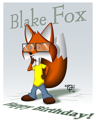
Birthday Boy Anthropomorph

Adobe Illustrator CS 2

I don't know how much this actually looks like the boy I based the picture on, but for me, it captures some of his thoughtfulness and complexity.
Just a straightforward illustration. I created all the base shapes, then used the Offset Path command with negative numbers to make smaller inner shapes. The base shapes I gave darker colors, the inner shapes lighter colors, then blended.
I used the Free Transform tool to put the sidewalk and text into perspective. :)