Showing posts with label draw. Show all posts

Sunday, November 7, 2021

Rise of the Red Skull

I provided the pencil work, then my friend Tom inked over the pencils.  I scanned the inked artwork and colored it in free-to-download Gimp.
Finished art

Finished inks

Pencil layout

Great Awakening Caricatures

I created these caricatures of Jonathan Edwards and George Whitefield for a woman in my Bible study.  Edwards and Whitefield helped lead the 18th-century Great Awakening revival movement.
Most of the Jonathan Edwards reference pictures showed the same facial characteristics, making picking reference pictures easy.  Many of the George Whitefield pictures looked like different people.  I collected the most common depictions and hope I captured Whitefield's actual likeness.
I downloaded the free Inkscape vector illustration program a couple months ago.  Adobe won't re-authorize the programs I already own, and I don't want to rent my programs from the Cloud.  I have over 20 years of Adobe Illustrator ingrained in my head, and Inkscape shares almost nothing similar to IllustratorI'm getting it down though.  I created these in Inkscape.
1 Corinthians 10:31- So, whether you eat or drink, or whatever you do, do all to the glory of God.
Ephesians 5:14- ...Therefore it says, "Awake, O sleeper, and arise from the dead, and Christ will shine on you.

Monday, August 30, 2021

Portraits and House Pen & Ink Illustration

    I did this pen & ink illustration of my friends with their house. I used:

  • 11x17 bristol vellum
  • Higgins Eternal black ink
  • Winsor & Newton #2 and #3 brushes
  • Hunts crowquil 102 and 107
  • Microns
  • gum eraser
  • Daler Rowney Bleed proof White
  • X-acto knife
Finished Illustration

Framed and Mounted

Saturday, August 28, 2021

Commissioned Stylized Caricatures

"The Bad-Joke Guys"

    A friend commissioned me to illustrate his idea of him and his two buddies, all in Christian ministry coming from different walks of life.

    I should have made this a vector illustration in Illustrator instead of a bitmap illustration in Photoshop with a Wacom.  Fixing mistakes or making changes took forever.  I used the Brush tool for most of the project.  I used the default black foreground and white background; I drew with the black, then pressed x to 'erase' with white.
    I used the Pen Tool to create the patches on the vest:
  1. In the Brush Tool options, I set the Brush Master Diameter to two points
  2. I used the Pen Tool to draw a path in the shape of the patch on the vest.
  3. I right-clicked over the path to bring up the Stroke Path option
  4. Clicking the Stroke Path option brings up the Stroke Path / Tool: option dropdown menu
  5. From the dropdown menu, I selected Brush, and a 2 point brush line stroked the path
    I made the chains on the front of the vest in Illustrator with the Art Brush tool.  I imported the chains into Photoshop as Smart Objects, so I could resize them without losing resolution.  I made the background in Illustrator also.

    My friend liked the finished product.  He surprised his buddies with copies for each of them, and they liked it also.

Monday, June 15, 2015

Commissioned Cartoon Concept

    A friend hired me to illustrate this project for their customer who had an inside joke they wanted to be printed on t-shirts.
    I sketched the rats while sitting in a dentist's lobby waiting for a friend. I scanned the rats into Photoshop, opened the file in Illustrator, and did all the blacks as vector art. 😁

Thursday, June 26, 2014

Anniversary Illustration

Eva and Shadow
     For an anniversary present for his wife, my friend commissioned me to illustrate a picture of his wife and their recently deceased kitty.  For reference he sent me a phone cam pic he just happened to catch when the moment happened.
     I opened the jpg in Adobe Photoshop, and YIKES!  Very small and pixelated! (He warned me of the pic quality ahead of time).  Pretty much a small, dark, fuzzy 72 ppi jpg.  I forget the original dimensions, but my friend had asked for an 8.5" x 11" illustration.  Using Photoshop's Image Size functions (Alt-Ctrl-i) I increased the dimensions as far as I could without losing too much detail so I could work on top of the photo.  I could only increase it to about 8" x 10".
     Since I would print the final result, I set the Image Mode to CMYK (Alt-i-m-c).
     Dark rooms and phone cam pics without a flash don't mix, and so the photo had muddy colors and hard-to-see detailsAdding new Adjustment Layers (Alt-l-a) I adjusted the Levels and Hue/Saturation until I had a brighter, clearer photo.
     I created four layers:
--a background layer which I filled with white (Alt-Delete fills the layer with the foreground color, Ctrl-Delete  fills the layer with the background color),
--the photo layer,
--a color layer I would use to paint under the inks,
--and the inks layer.
     The inks layer: switching between my Wacom Intuos 4 and the mouse, I went for a kind of pen and ink graphic design stylization that kind of comes naturally to me, .  Using lines, dots, simplified shapes, and some Franklin Booth-inspired hatching, I drew over the photo.  I made some of the contours more geometric, and worked to capture the essence of the details with minimal shapes and strokes.  With the white background layer I could make the photo layer invisible (clicking the eye graphic next to the photo layer in the Layer Window) to see just the ink layer and check my work.

Inks Layer
 
     Painting in the color layer underneath the inks layer, I used the Eyedropper tool to pick colors from the photo layer.  I continued rendering with geometric shapes.  I kept the curtains, pillow, and shirt colors flat to keep the focus on the cat and woman's face.
 Color Layer

Detail
 
     I printed the illustration at the local Fedex/Kinko's and sent it off so it would get to my friend in time for their anniversary.  Afterward they both told me they like it and will get it framed and hung as soon as possible. :)
Adobe Photoshop CS2

Tuesday, February 7, 2012

Community Passages Logo Concept

The company I work for, Community Passages, is a subsidiary of Resources for Human Development.  Community Passages provides assistance to mentally and physically challenged individuals.  The big wigs decided to host a competition for Community Passages employees to create a company logo.  Obviously a challenge right up my alley, I designed this logo:  
The C and P initials make up the outer heart shape;
The heart stands for the heart we have for our special needs individuals we work with, and also our heart for making "passages" for them into their communities;
One side of the middle "split" represents our individuals; the other side the community;
The clasped hands represent integration between our individuals and community;
The hands and opposing colors crossing over the middle represent crossing over barriers of separation between our individuals and community;
The orange and purple are color compliments, both of which are generally considered "passionate" colors.
While a little too small to be seen in the logo, in the hands I attempted to add some extra dimension, creating little spaces in between shapes to make an illusion of some shapes in front/back of others.  I've done this in other illustrations like the Armor of God and Kitty Cop, trying to get something more 3D from flat 2D line art.

I used my phone cam to take a photo of my wife's and my hand clasped for reference.  I had to enlarge her hand since it's a good bit smaller than mine. ;)

I could probably execute my ideas behind this logo a hundred different ways (alright, maybe at least a dozen or two).  I'll simplify the hands at some point to allow more readability when downsized. :)

Friday, November 19, 2010

Illustration Friday-- Sneaky

Moroccan Mark/Adobe Illustrator
This man looks like he could be a little sneaky. :) Actually, this was a friend's Halloween costume, and inspired me enough to draw a caricature of him. :)

Monday, November 16, 2009

Big Boss Man

For Illustration Friday's Unbalanced. Usually the old man gets a little crazy around mid-week, but Nerble takes it in stride.
Adobe Illustrator CS2
Adobe Illustrator /PhotoshopWeathered version: I exported the Illustrator file as a tiff, then opened it in Photoshop. I opened a photo I'd taken of a cracked asphalt sidewalk, then dragged and dropped it onto my illustration. I blended the texture into the main illustration using the Multiply filter, then manipulated the transparency until the illustration still dominated but the texture showed through just enough.
I changed the background into a layer, then added a layer underneath the illustration layer, and turned the color to brown. I erased some of the illustration layer to let the brown background show through. Then I created some additional distress drawing cracks, highlights and shadows the Dodge and Burn tools. :)

Friday, October 23, 2009

Sweating the Small Stuff

I did this piece as a flyer for a Sunday morning Bible study I led. Unfortunately, I didn't get it to the printer fast enough (Yet another lame attempt to fit the Illustration Friday meme. This week it's Fast).
Adobe Illustrator CS2
I really enjoy the look of super-tight comic book inking, say, along the lines of The Art of Comic Book Inking volumes 1 and 2 by Gary Martin. Some of the examples in those books stagger my mind as far as tightness, getting the perfect balance of light and dark, and making all the lines work so the image comes alive, not just putting down lines however you feel like it. Another awesome book about inking is Rendering in Pen and Ink by Arthur L. Guptill; a big tome of a book that's worth every hour to read it.

The figure came first; the background and text came later. First I sketched the figure in pencil, scanned it into Illustrator, then traced it with the pen tool. I did all the blacks first, working out shadows and forms until it stood alone as a solid black and white illustration. I then started applying flat colors: 4 shades for the armor, 3 shades for the gold-lighted glass (I didn't know how many layers of color I would use originally, that's just how it worked out).

All the little tapered lines are, for the most part, blended triangles, shaped to fit whatever form I needed. I'm not a big fan of outlines. I do wind up using them here and there, but I'm trying to get out of the habit. I try to think more in terms of light, shadow, and dimension, trying to figure out how to make 2D pop out like 3D. :)


Sunday, October 5, 2008

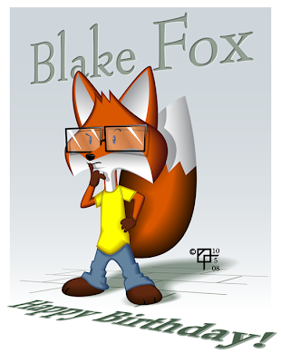
Birthday Boy Anthropomorph

Adobe Illustrator CS 2

I don't know how much this actually looks like the boy I based the picture on, but for me, it captures some of his thoughtfulness and complexity.
Just a straightforward illustration. I created all the base shapes, then used the Offset Path command with negative numbers to make smaller inner shapes. The base shapes I gave darker colors, the inner shapes lighter colors, then blended.
I used the Free Transform tool to put the sidewalk and text into perspective. :)